Embedding Reusable Custom Widgets in Catalog Items
In general, the best catalog items are simple, straightforward, and easy to maintain. Adding custom embedded widgets to a catalog form can often make support and future enhancements more complicated and confusing. However, when used correctly, reusable custom widgets can add significant value across your whole catalog while introducing minimal additional complexity.
For example, if you have many catalog items with a shipping address section, you could create a single, configurable widget for a typeahead address input with API validation. A widget like this could greatly improve both the user experience and the quality of the provided address data. Additionally, if built correctly, adding in that upgraded custom input to a form can be as easy as adding one new variable record without requiring any changes to the existing form logic.
In this post, I'll walk through three examples of reusable catalog item widgets which cover what I consider to be the most effective patterns and the most common use-cases. For each example, I've included screenshots and the code for the widget. Additionally, if you want to see the widgets in action, you can download Reusable Custom Widgets for Catalog Items from ServiceNow Share where I've added these widgets to an example catalog item.
Example 1: Loading Indicators
1 <div id="supernow-loading-field" class="sp-loading-indicator" ng-class="'v'+widget.sys_id" style="display: none;"> 2 <div></div> 3 <div></div> 4 <div></div> 5 </div> 6 7 <div id="supernow-loading-block-skeleton" ng-class="'v'+widget.sys_id" style="display: none"> 8 <div class="supernow-loading-block-skeleton"> 9 <div class="loading card-title shorter-s"></div> 10 <div class="loading table-content"></div> 11 <div class="loading card-title shorter-m"></div> 12 <div class="loading table-content"></div> 13 <div class="loading card-title shorter-xs"></div> 14 <div class="loading table-content"></div> 15 </div> 16 </div> 17 18 <div id="supernow-loading-block-loader" ng-class="'v'+widget.sys_id" style="display: none"> 19 <div class="supernow-mug-container"> 20 <div class="supernow-mug"> 21 <div class="supernow-coffee"></div> 22 </div> 23 <span class="loader-text"> 24 Loading . . . 25 </span> 26 </div> 27 </div> 28 29 <div id="supernow-loading-overlay" ng-class="'v'+widget.sys_id" style="display: none"> 30 <div id="supernow-loading-overlay-inner"> 31 <div class="supernow-mug-container"> 32 <div class="supernow-mug"> 33 <div class="supernow-coffee"></div> 34 </div> 35 <span id="supernow-loading-overlay-text" class="loader-text"> 36 Loading . . . 37 </span> 38 </div> 39 </div> 40 </div> 41 42 <style> 43 #catItemTop > * { 44 position: relative; 45 } 46 </style>
1 api.controller=function($scope, $rootScope) { 2 var c = this; 3 c.activeLoaders = {}; 4 c.madeReadOnlyFields = {}; 5 c.movedOverlay = false; 6 7 /* 8 PROPERTIES: 9 type 10 Description: the type of loader to show (small loading icon next to a field's label, a placeholder loader to indicate field will soon be shown in that area, a loader showing below a field on the form along with loading text, or a whole-form overlay loader that will prevent interacting with the form while loading) 11 Value: "field", "block-skeleton", "block-loader", or "overlay" 12 Default: "overlay" 13 action 14 Description: whether to hide or show the loader specified 15 Value: "show" or "hide" 16 Default: "show" (unless a matching loader already exists and is displayed) 17 Applies for type: All 18 text: 19 Description: the text to show below the loading animation 20 Value: any string 21 Default: "Loading . . ." 22 Applies for type: "block-loader" and "overlay" 23 field: 24 Description: the field to attach the loader to or below 25 Value: the name of any variable in the catalog item 26 Default: the variable embedding this widget 27 Applies for type: "field", "block-skeleton", and "block-loader" 28 disableField: 29 Description: whether the corresponding field should be made read-only while loading 30 Value: true or false 31 Default: true 32 Applies for type: "field", "block-skeleton", and "block-loader" 33 34 EXAMPLES: 35 {"type": "field", "field": "test", "disableField": false} 36 {"type": "block-loader", "field": "test", "action": "show"} 37 {"text": "Loading form data . . . ""} 38 */ 39 var fieldChangeListener = $rootScope.$on("field.change."+$scope.page.field.name, function(evt, parms) { 40 if(parms.newValue){ 41 try{ 42 var val = JSON.parse(parms.newValue); 43 var show = true; 44 var el; 45 var textElement; 46 if(val.type == 'field' || val.type == 'block-skeleton' || val.type == 'block-loader'){ 47 if(!val.field) val.field = $scope.page.field.name; 48 el = document.getElementById("supernow-loading-"+val.type+"-"+val.field); 49 if(val.hasOwnProperty('action')){ 50 show = val.action == 'show'; 51 }else if(el){ 52 show = el.style.display == 'none'; 53 } 54 if(show){ 55 if(!el){ 56 var p = document.getElementById("supernow-loading-"+val.type); 57 el = p.cloneNode(true); 58 el.id = "supernow-loading-"+val.type+"-"+val.field; 59 var fieldLabel = val.type == 'field' ? $('#'+val.field+' label.field-label')[0] : $('#'+val.field+':has(.form-group)')[0]; 60 fieldLabel.appendChild(el); 61 } 62 if(val.type == 'block-loader'){ 63 textElement = $('#supernow-loading-block-loader-'+val.field+' .loader-text')[0]; 64 textElement.innerHTML = val.text ? val.text : 'Loading . . .'; 65 } 66 el.style.display = val.type == 'field' ? 'inline-flex' : 'block'; 67 if(!val.hasOwnProperty('disableField') || val.disableField === true || val.disableField === 'true'){ 68 if(!$scope.page.g_form.isReadOnly(val.field)){ 69 c.madeReadOnlyFields[val.field] = true; 70 $scope.page.g_form.setReadOnly(val.field, true); 71 } 72 } 73 c.activeLoaders[val.type+'-'+val.field] = true; 74 }else{ 75 el.style.display = 'none'; 76 if(val.type == 'block-loader'){ 77 textElement = $('#supernow-loading-block-loader-'+val.field+' .loader-text')[0]; 78 textElement.innerHTML = ''; 79 } 80 if(c.madeReadOnlyFields.hasOwnProperty(val.field)){ 81 delete c.madeReadOnlyFields[val.field]; 82 $scope.page.g_form.setReadOnly(val.field, false); 83 } 84 delete c.activeLoaders[val.type+'-'+val.field]; 85 } 86 }else{ 87 el = document.getElementById('supernow-loading-overlay'); 88 textElement = document.getElementById('supernow-loading-overlay-text'); 89 if(val.hasOwnProperty('action')){ 90 show = val.action == 'show'; 91 }else if(el){ 92 show = el.style.display == 'none'; 93 } 94 if(show){ 95 if(!c.movedOverlay){ 96 var catItem = document.getElementById('catalog-form'); 97 catItem.appendChild(el); 98 } 99 textElement.innerHTML = val.text ? val.text : 'Loading . . .'; 100 el.style.display = 'block'; 101 c.activeLoaders.overlay = true; 102 }else{ 103 el.style.display = 'none'; 104 textElement.innerHTML = ''; 105 delete c.activeLoaders.overlay; 106 } 107 } 108 }catch(e){ 109 console.log('Could not set a loading indicator using the value: '+parms.newValue+'\n\nEnsure that the value you are setting is valid JSON with double quotes around both property names and string values'); 110 } 111 $scope.page.g_form.clearValue($scope.page.field.name); 112 } 113 }); 114 $scope.$on("$destroy", fieldChangeListener); 115 116 $scope.page.g_form.$private.events.on('onSubmit', function(){ 117 if(Object.keys(c.activeLoaders).length){ 118 $scope.page.g_form.addErrorMessage('Please wait for the form to finish loading'); 119 return false; 120 } 121 }); 122 };
1 /* block-skeleton */ 2 .supernow-loading-block-skeleton .card-title.loading { 3 margin-bottom: 5px; 4 height: 14px; 5 } 6 .supernow-loading-block-skeleton .card-title.loading.shorter-s{ 7 width: 25%; 8 } 9 .supernow-loading-block-skeleton .card-title.loading.shorter-m{ 10 margin-top: 21px; 11 width: 30%; 12 } 13 .supernow-loading-block-skeleton .card-title.loading.shorter-xs{ 14 margin-top: 21px; 15 width: 20%; 16 } 17 .supernow-loading-block-skeleton .loading { 18 position: relative; 19 background-color: #f1f1f1; 20 overflow: hidden; 21 } 22 .supernow-loading-block-skeleton .table-content.loading { 23 border-radius: 4px; 24 height: 34px; 25 width: 100%; 26 } 27 .supernow-loading-block-skeleton .loading::after { 28 content: ""; 29 position: absolute; 30 animation: 2s supernow-block-loading linear 0.5s infinite; 31 background: linear-gradient(90deg, transparent, #e6e6e6, transparent); 32 bottom: 0; 33 left: 0; 34 right: 0; 35 top: 0; 36 } 37 @keyframes supernow-block-loading { 38 0% { 39 transform: translateX(-100%); 40 } 41 60% { 42 transform: translateX(100%); 43 } 44 100% { 45 transform: translateX(100%); 46 } 47 } 48 /* overlay */ 49 #supernow-loading-overlay-inner { 50 position: absolute; 51 top: 0; 52 left: 0; 53 width: 100%; 54 height: 100%; 55 z-index: 19; 56 background-color: rgba(0, 0, 0, 0.1); 57 backdrop-filter: blur(2px); 58 } 59 /* coffee mug for overlay and block-loader */ 60 .supernow-mug { 61 width: 40px; 62 height: 45px; 63 display: inline-block; 64 position: relative; 65 border: 4px solid #206AAA; 66 animation: fill 2s linear infinite alternate; 67 color: rgba(160, 84, 37, 0.9); 68 border-radius: 0 0 4px 4px; 69 z-index: 5; 70 &::after { 71 content: ''; 72 position: absolute; 73 left: 100%; 74 top: 50%; 75 transform: translateY(-50%); 76 border: 4px solid #206AAA; 77 width: 20px; 78 height: 25px; 79 border-radius: 0 8px 8px 0; 80 } 81 } 82 .supernow-coffee{ 83 position: absolute; 84 left: 2px; 85 right: 2px; 86 bottom: 2px; 87 margin: 2px; 88 background: #a05425; 89 border-radius: 0 0 6px 6px; 90 animation: supernow-coffee 4s ease-in-out infinite alternate-reverse; 91 } 92 @keyframes supernow-coffee { 93 from { 94 top: calc(100% - 35px); 95 } 96 to { 97 top: calc(100% - 7px); 98 } 99 } 100 .supernow-mug-container .loader-text { 101 font-size: 1.3em; 102 font-weight: 600; 103 color: #206AAA; 104 margin-top: 15px; 105 } 106 .supernow-mug-container .loader-text { 107 color: #002677; 108 } 109 .supernow-mug-container{ 110 display: flex; 111 height: 100%; 112 flex-direction: column; 113 align-items: center; 114 justify-content: center; 115 }
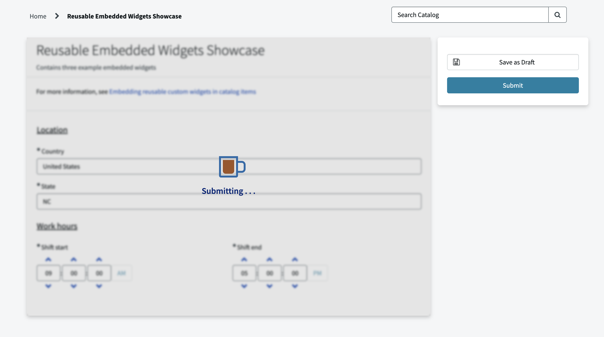
This example widget doesn't capture any user input; instead, catalog client scripts can trigger it to show various loading indicators on the form. One example where a widget like this would be useful is if a form includes a slow-running script or API call. In that scenario, you could see issues from the user modifying the values of other variables while the GlideAjax is still running and the data returned from the GlideAjax might no longer be relevant when it finally hits the callback. This widget allows you to make the loading more prominent or use an overlay to prevent user interaction with the form until loading completes.
1. How to create the variable for embedding the widget
To add a widget to a form, you need a variable with:
- A Type value of Custom, Custom with Label, or Single Line Text.
- A widget referenced in the Widget (sp_widget) field and/or a value in the Default Value field like
{widget: 'supernow-loading-indicators'}.- If using Single Line Text, the Widget field must have a value.
- If both are specified and are different, the widget specified in the default value is used.
For this example, we don't want the widget variable itself to display or take up any space on the form. So, we use the Type "Custom" to not have a label included and we check the "Hidden" checkbox for the variable.
2. How to trigger the widget from a client script
The easiest way to communicate to and from a widget is to set values on the form and listen for those changes.
An embedded widget comes with built-in access to g_form through $scope.page.g_form (don't forget to inject $scope into your controller), which makes it easy to set values from the widget. To set up the widget to listen for changes to a variable's value, the most straightforward option is to inject $rootScope into the controller and set up a listener for the event name "field.change". The function attached to that listener will trigger on any variable's value changing, but if you want to listen just for changes to a specific variable, append that variable name to the event name like "field.change.variable_name".
In this example, a client script triggers the widget by setting the value of the variable that embeds the widget. So, it has a watcher like this:
var fieldChangeListener = $rootScope.$on("field.change."+$scope.page.field.name, function(evt, parms) {
   [ . . . ]
});
$scope.$on("$destroy", fieldChangeListener);
Notes:
- The widget can access the name of the variable it is embedded in by using
$scope.page.field.name. - The changed variable's value is in the "newValue" property of the second parameter.
- Important: when setting a watcher on $rootScope, ensure that you clear that watcher when the current scope is destroyed (as shown in the example above)
This example expects a client script to set its variable's value to be an object containing the details of the loading indicator to be shown. The listener clears out the value of its variable so that the value set is treated like a "message", rather than maintaining the state of the loaders in the variable value itself.
3. How to add elements elsewhere in the form
In this example, we want to add loading indicators elsewhere in the form and not be limited to just displaying where the widget's variable is placed. It's easy to use JavaScript to clone, move, or create elements. However, be aware that moving an element preserves its AngularJS linkages to the controller, but cloning or creating an element does not. In this example, that distinction isn't important. However, if the loading elements needed access to the controller scope, you could use an ng-repeat to generate as many elements as needed and move those, instead of cloning and moving.
One other important thing to note is that all the selectors defined in the widget's CSS field will have a class selector of "v" plus the widget's sys_id prepended. This means that elements you move or create outside of the widget's element won't have the widget's CSS applied. For this example, this issue was avoided by manually appending a matching class to each element moved outside the widget and also just defining simple styling inline in the HTML. Alternatively, you could create a <style> element in the HTML or add your styling to a portal-wide stylesheet, but with that approach it's important to keep your selectors very specific as those selectors will apply to the whole page or portal respectively.
4. How to handle onSubmit validation
If your widget needs to perform some validation onSubmit, the officially recommended option would be to keep some hidden variable on the form up to date with whatever data is relevant for the onSubmit check (setting the value of that variable in the widget using $scope.page.g_form.setValue). This allows you to use a normal onSubmit catalog client script to perform validation using the data stored in the hidden variable.
However, that approach makes your reusable widget less "plug and play", as you'll need to add onSubmit client script logic to every form where your widget is included. So, in this example, we use an undocumented g_form event listener with the code: $scope.page.g_form.$private.events.on('onSubmit', function(){ [ . . . ] });. The specified function will work the same as an onSubmit client script, allowing you to block submission using return false;—except in this function you can access all the data from your widget's scope.
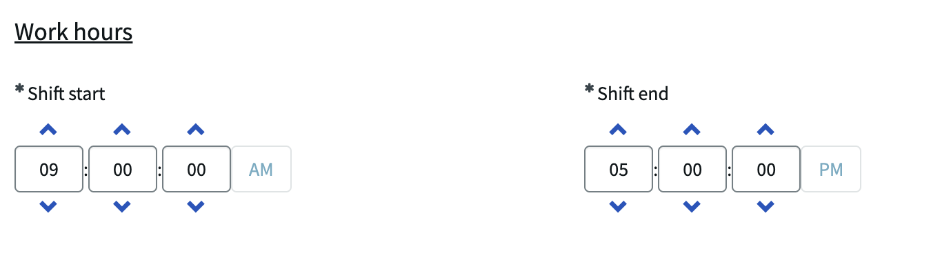
Example 2: Time Picker
1 <div uib-timepicker 2 ng-model="c.selectedTime" 3 ng-change="c.storeValue()" 4 ng-disabled="page.field.isReadonly()" 5 hour-step="options.hourStep" 6 minute-step="options.minuteStep" 7 show-seconds="options.showSeconds" 8 second-step="options.secondStep" 9 show-meridian="options.showMeridian" 10 meridians="options.meridians" 11 show-spinners="options.showSpinners" 12 mousewheel="options.mousewheel" 13 arrowkeys="options.arrowkeys" 14 readonly-input="options.readonlyInput" 15 min="options.min" 16 max="options.max"> 17 </div>
1 api.controller=function($scope, $rootScope) { 2 var c = this; 3 4 c.dateFromString = function(string){ 5 if(string){ 6 var timeParts = string.split(':'); 7 var hourPart = parseInt(timeParts[0], 10); 8 if(hourPart){ 9 var date = new Date(); 10 date.setHours(parseInt(timeParts[0], 10)); 11 if(timeParts.length > 1){ 12 date.setMinutes(parseInt(timeParts[1], 10) || 0); 13 if(timeParts.length > 2){ 14 date.setSeconds(parseInt(timeParts[2], 10) || 0); 15 }else{ 16 date.setSeconds(0); 17 } 18 }else{ 19 date.setMinutes(0); 20 } 21 return date; 22 } 23 } 24 return undefined; 25 }; 26 27 c.stringFromDate = function(date){ 28 var timeString = ''; 29 if(date){ 30 var hours = date.getHours(); 31 var minutes = date.getMinutes(); 32 var seconds = date.getSeconds(); 33 timeString += (hours < 10 ? "0" + hours : hours) + ":"; 34 timeString += (minutes < 10 ? "0" + minutes : minutes) + ":"; 35 timeString += $scope.options.showSeconds ? (seconds < 10 ? "0" + seconds : seconds) : '00'; 36 } 37 return timeString; 38 }; 39 40 c.storeValue = function() { 41 c.storedValue = c.stringFromDate(c.selectedTime); 42 $scope.page.g_form.setValue($scope.page.field.name, c.storedValue); 43 }; 44 45 var fieldChangeListener = $rootScope.$on("field.change."+$scope.page.field.name, function(evt, parms) { 46 if(parms.newValue != c.storedValue){ 47 c.selectedTime = c.dateFromString(parms.newValue); 48 } 49 }); 50 $scope.$on("$destroy", fieldChangeListener); 51 52 if(!$scope.options.hasOwnProperty('showSpinners')) $scope.options.showSpinners = true; 53 if(!$scope.options.hasOwnProperty('showMeridian')) $scope.options.showMeridian = true; 54 if(!$scope.options.hasOwnProperty('showSeconds')) $scope.options.showSeconds = false; 55 if(!$scope.options.hasOwnProperty('hourStep')) $scope.options.hourStep = 1; 56 if(!$scope.options.hasOwnProperty('minuteStep')) $scope.options.minuteStep = 1; 57 if(!$scope.options.hasOwnProperty('secondStep')) $scope.options.secondStep = 1; 58 if(!$scope.options.hasOwnProperty('readonlyInput')) $scope.options.readonlyInput = false; 59 if(!$scope.options.hasOwnProperty('mousewheel')) $scope.options.mousewheel = true; 60 if(!$scope.options.hasOwnProperty('arrowkeys')) $scope.options.arrowkeys = true; 61 if(!$scope.options.hasOwnProperty('meridians')) $scope.options.meridians = ['AM', 'PM']; 62 $scope.options.max = c.dateFromString($scope.options.max); 63 $scope.options.min = c.dateFromString($scope.options.min); 64 var currentValue = $scope.page.g_form.getValue($scope.page.field.name); 65 c.selectedTime = currentValue.indexOf('{') != -1 ? c.dateFromString($scope.options.defaultTime) : c.dateFromString(currentValue); 66 c.storeValue(); 67 };
This example widget shows how to create a reusable option for capturing a type of input not normally supported: a "time" input. Dictionary entries have the type Time available, but variables only have Date and Date/Time. So, if you have a record producer for a record with a time field (like the sys_holiday table), you normally would have to use a Single Line Text variable and either add validation on the form to prevent invalid time values like "5 PM" or use a record producer script to transform the user input into a value that the Time field on the produced record will accept. This Time Picker widget both improves the user experience and ensures data is always in the correct format. This widget displays as an upgraded input pre-submit, supports defining options for each instance, and is integrated with the form so that it can be treated just like any other variable.
1. How to display post-submit
If your widget captures user data, you'll likely want to display that data in the requested item after the form is submitted. (If you're using a record producer, you can skip this section if the variable editor for the submitted information isn't shown on the produced record.) Prior to submitting the form, this post assumes that the catalog items including the custom widgets will only be accessed in the Service Portal where the widget will always display for the variable. However, the submitted requested item can be accessed in all three different UIs: portals, classic environments (native UI), and workspaces. Because the widgets use AngularJS, they won't render in the classic environment or a workspace. There are three main options for displaying the data post-submit:
- If the data captured by your widget can display as Single Line Text, then the variable with your embedded widget can use that type instead of Custom or Custom with Label.
- This will result in Service Portal showing your widget still, while elsewhere it will show as a Single Line Text.
- This option is used by this example widget.
- Note: the Widget field doesn't show on the variable form for the type Single Line Text; either add the Widget value from the list view of variables or set the type to Custom, update the Widget field, and then switch back to Single Line Text.
- If the submitted data for the widget needs to display as a different variable type (like a reference or a date), create or use a separate variable for storing the data and displaying post-submit.
- Set this variable's value on change of your input or on submit and set the widget variable to only show pre-submit in the catalog item and the other variable to only show post-submit in requested items and catalog tasks.
- In example #3, we use this approach and also handle the hiding and showing in the widget's client script itself.
- If you don't want the submitted data to just display as a normal field and need a custom element to show even in the classic environment and workspaces, your only option is to create a custom UI macro and a custom Next Experience component and include them in the Macro and Macroponent fields in your variable.
- This option requires significant work because you have to create entirely new versions of your widget using two totally different frameworks (unless you wanted to go with a complicated solution where your macro and component use an iframe to embed a portal page with just your widget and update your widget to take values from URL parameters—but I wouldn't recommend that).
- Also, when using a macro in the classic environment it might not allow you to set the value of that variable using g_form.
2. How to define options for each instance of the widget
For this widget, we use UI Bootstrap's uib-timepicker directive which is included by default in the Service Portal. That directive includes many different options you can specify, like whether to include seconds and whether to use 24- or 12-hour time. In this example, passing options to a specific instance of the widget is not required but is supported (e.g. if you wanted one Work Start variable with a "max" value of 12:59:59 and another Work End variable with a "min" value of 13:00:00).
To specify options for an embedded widget, include an object in the "Default value" field of the variable. For example:
{
   "mousewheel": false,
   "showSeconds": true,
   "defaultTime": "09:00:00",
   "max": "12:59:59"
}
The embedded widget instance can then access the options data in a few different places:
- From the $scope data. Can use either $scope.options, $scope.widget_parameters, or $scope.widget.options (I don't think there's any difference between these three).
- From the "options" object in the server script, which can be made available to the client script with a line like:
data.options = options;(this option is mainly useful if you have on load server code that depends on and potentially updates the options). - From the g_form value of its variable using
$scope.page.g_form.getValue($scope.page.field.name);.
If the widget won't display in the portal post-submit and the form doesn't support drafts, the approach used won't matter because the widget will only pull options once on initial catalog item load. Otherwise, you'll need to consider the following:
- Approach #3 shouldn't be used if the widget overwrites its own g_form value to store the user's input.
- Approach #1 and #2 will use the current default value from the variable, whereas approach #3 will keep whatever the value was when the form was submitted or the draft was saved. So, approach #3 is great if the options can change and more accurately represent the "current state" of the widget. However, with approach #3 you'll need to be careful about changing your option schema because the widget will still need to support options from previously submitted/saved requests.
Note: if using approach #1 or #2, the options object will also include some properties added by default. So, make sure to not accidentally use the same property name and be aware they are present if you plan to iterate through the options. The options currently included automatically are: preserve_placeholder_size, advanced_placeholder_dimensions, cat_item, sp_widget_dv, sp_column_dv, active, sys_tags, order, and async_load.
3. How to make your widget act like a normal variable
Our goal with a widget like this (which uses type Single Line Text and stores the input in its own variable) is that, other than setting the Widget field and potentially the Default value for the variable, the variable shouldn't require any special handling and should just work the same as any normal variable. With the approach this example uses, the widget only needs a little extra logic for this:
- For client scripts, UI policies, etc. to be able to get and set the value of your custom input, you'll need to sync the value of your custom input with the variable's g_form value.
- The simplest way is to include the following in your input:
ng-model="page.fieldValue" ng-model-options="{updateOn: 'blur', getterSetter: true}". - However, in this example, the value needs to be transformed both when getting and setting because the uib-timepicker uses a Date object whereas the variable's value should have a string formatted as "HH:mm:ss". So, for setting the variable's value you can add an ng-blur or ng-change function to your input and have that function transform the value and then store it using
$scope.page.g_form.setValue($scope.page.field.name, value);. For updating your custom input when something else changes the variable's value, you can watch for the field.change event on $rootScope (as described in point #2 of the first example) and transform the data before updating the variable you're using for your ng-model.
- The simplest way is to include the following in your input:
- For handling read-only, you'll have to add your own logic to prevent the user from interacting with your custom elements while the widget's variable is read-only. For this example, this was as easy as adding this attribute to the input element:
ng-disabled="page.field.isReadonly()".
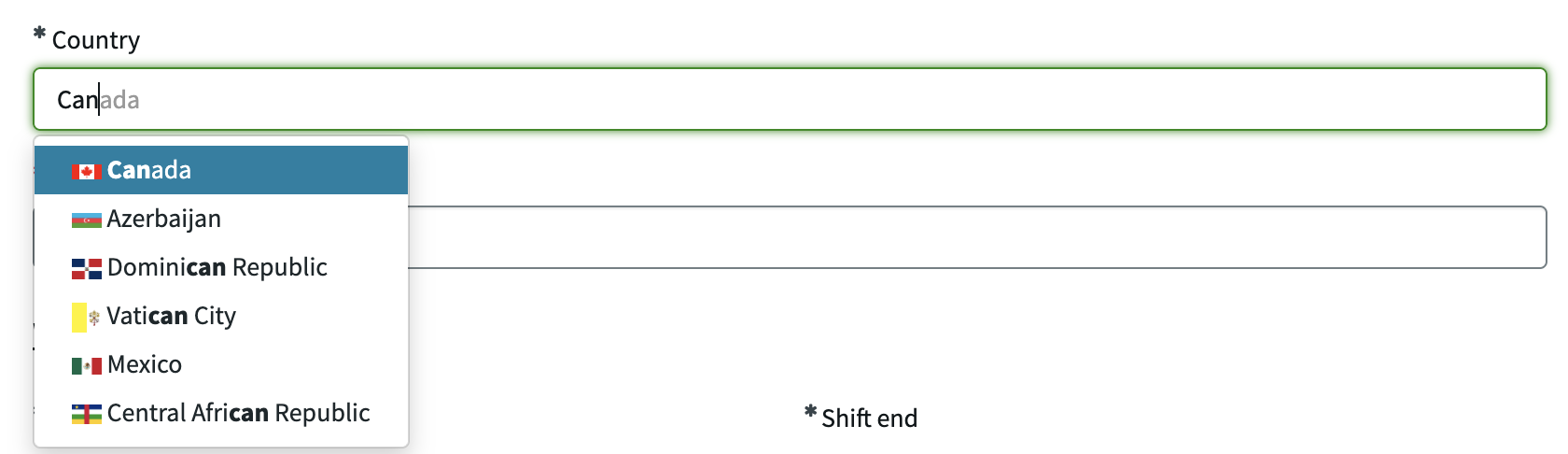
Example 3: Country Typeahead Picker
1 <div ng-if="c.isVisible"> 2 <script type="text/ng-template" id="typeaheadAddress.html"> 3 <a> 4 <img ng-src="{{match.model.flags.png}}" width="16"> 5 <span ng-bind-html="match.label | uibTypeaheadHighlight:query"></span> 6 </a> 7 </script> 8 <div class="form-group country-typeahead"> 9 <span ng-if="c.isMandatory" class="fa fa-asterisk mandatory" ng-class="{'mandatory-filled': c.selectedCountry}" aria-label="{{c.selectedCountry ? 'Required Filled' : 'Required'}}" role="img"></span> 10 <label for="typeahead-{{page.field.name}}">{{c.label}}<span ng-show="c.loadingLocations"> 11 <div class="loader"></div> 12 </span> 13 </label> 14 <input id="typeahead-{{page.field.name}}" type="text" ng-model="c.selectedCountry" placeholder="Search for country" ng-disabled="c.isReadOnly" 15 typeahead-on-select="c.select($item)" uib-typeahead="address as address.name.common for address in c.getLocation($viewValue)" 16 typeahead-select-on-blur="false" ng-blur="c.blur()" typeahead-loading="c.loadingLocations" typeahead-template-url="typeaheadAddress.html" typeahead-show-hint="true" 17 typeahead-no-results="noResults" class="form-control" typeahead-wait-ms="300" typeahead-min-length="0" typeahead-popup-limit="10"> 18 </div> 19 </div>
1 api.controller=function($scope, $http, $timeout){ 2 var c = this; 3 var currentValue = $scope.page.g_form.getValue($scope.page.field.name); 4 if(currentValue) currentValue = JSON.parse(currentValue); 5 if(currentValue && currentValue.linkedField){ 6 c.select = function(item){ 7 $scope.page.g_form.setValue(currentValue.linkedField, item.name.common); 8 }; 9 10 c.blur = function(){ 11 //timeout to give time for c.select to run first if an option was clicked 12 $timeout(function() {}, 500).then(function(){ 13 //if an option was selected then c.selectedCountry would change from string to object 14 if(typeof c.selectedCountry === 'string'){ 15 if(!c.loadingLocations && c.lastChecked == c.selectedCountry){ 16 if(!c.lastResults || !c.lastResults.length){ 17 c.selectedCountry = '' 18 if(currentValue) $scope.page.g_form.clearValue(currentValue.linkedField); 19 }else if(c.lastResults.length == 1){ 20 c.selectedCountry = c.lastResults[0]; 21 if(currentValue) $scope.page.g_form.setValue(currentValue.linkedField, c.lastResults[0].name.common); 22 }else if(c.lastResults.length > 1){ 23 c.selectedCountry = ''; 24 if(currentValue) $scope.page.g_form.clearValue(currentValue.linkedField); 25 }else{ 26 c.deferBlur = true; 27 } 28 }else{ 29 c.deferBlur = true; 30 } 31 } 32 }); 33 }; 34 35 c.getLocation = function(val){ 36 var apiToUse = val ? 'https://restcountries.com/v3.1/name/'+ val : 'https://restcountries.com/v3.1/all' 37 return $http.get(apiToUse, { 38 params: { 39 fields: 'cca2,cca3,name,translations,nativeName,altSpellings,flags,independent' 40 } 41 }).then(function(response){ 42 c.lastChecked = val; 43 if(!currentValue.includeTerritories){ 44 response.data = response.data.filter(function(country) { 45 return country.independent === true; 46 }); 47 } 48 c.lastResults = response.data; 49 $scope.page.g_form.hideFieldMsg($scope.page.field.name, true); 50 if(c.deferBlur){ 51 c.deferBlur = false; 52 c.loadingLocations = false; 53 c.blur(); 54 } 55 return response.data; 56 }, function(response){ 57 c.lastChecked = val; 58 c.lastResults = ''; 59 $scope.page.g_form.showFieldMsg($scope.page.field.name, 'Could not find a country matching "'+val+'"', 'error'); 60 if(c.deferBlur){ 61 c.deferBlur = false; 62 c.loadingLocations = false; 63 c.blur(); 64 } 65 return []; 66 }); 67 }; 68 69 c.init = function(){ 70 c.selectedCountry = ''; 71 c.lastResults = ''; 72 c.lastChecked = ''; 73 c.deferBlur = false; 74 c.isMandatory = $scope.page.g_form.isMandatory(currentValue.linkedField); 75 c.isVisible = $scope.page.g_form.isVisible(currentValue.linkedField); 76 c.isReadOnly = $scope.page.g_form.isReadOnly(currentValue.linkedField); 77 var linkedFieldDetails = $scope.page.g_form.getField(currentValue.linkedField); 78 c.label = linkedFieldDetails ? linkedFieldDetails.label : 'Country'; 79 $scope.page.g_form.$private.events.on("onPropertyChange", function(type, field, attribute, value){ 80 if(type == 'FIELD' && field == currentValue.linkedField){ 81 if(attribute == 'visible'){ 82 c.isVisible = value; 83 }else if(attribute == 'readonly'){ 84 c.isReadOnly = value; 85 }else if(attribute == 'mandatory'){ 86 c.isMandatory = value; 87 }else if(attribute == 'messages'){ 88 $scope.page.g_form.hideFieldMsg($scope.page.field.name, true); 89 for(var i = 0; i < value.length; i++){ 90 $scope.page.g_form.showFieldMsg($scope.page.field.name, value[i].message, value[i].type); 91 } 92 }else if(attribute == 'label'){ 93 c.label = value; 94 } 95 } 96 }); 97 var linkedFieldValue = $scope.page.g_form.getValue(currentValue.linkedField); 98 if(linkedFieldValue){ 99 c.selectedCountry = linkedFieldValue; 100 c.deferBlur = true; 101 c.getLocation(linkedFieldValue); 102 } 103 $scope.page.g_form.$private.events.on('onChange', function(field, blank, value){ 104 if(field == currentValue.linkedField){ 105 if(!c.selectedCountry || typeof c.selectedCountry === 'string' || c.selectedCountry.name.common != value){ 106 c.selectedCountry = value; 107 if(c.selectedCountry){ 108 c.deferBlur = true; 109 c.getLocation(value); 110 } 111 } 112 } 113 }); 114 $scope.page.g_form.$private.events.on('submit', function(){ 115 $scope.page.g_form.clearValue($scope.page.field.name); 116 }); 117 var el = $('.sp-form-container #'+currentValue.linkedField); 118 if(el[0] && el[0].style) el[0].style.display = 'none'; 119 }; 120 c.init(); 121 }else{ 122 $scope.page.g_form.setDisplay($scope.page.field.name, false); 123 } 124 };
1 /* loading icon */ 2 .loader { 3 border: 2px solid #b7b7b7; 4 border-top: 2px solid #3498db; 5 border-radius: 50%; 6 width: 14px; 7 height: 14px; 8 animation: spin 2s linear infinite; 9 display: inline-block; 10 } 11 @keyframes spin { 12 0% { transform: rotate(0deg); } 13 100% { transform: rotate(360deg); } 14 } 15 /* to limit the height of the dropdown and to include a scrollbar */ 16 .dropdown-menu { 17 max-height: 250px; 18 overflow-y: auto; 19 } 20 .country-typeahead .dropdown-menu::-webkit-scrollbar { 21 -webkit-appearance: none; 22 width: 8px; 23 } 24 .country-typeahead .dropdown-menu::-webkit-scrollbar-thumb { 25 border-radius: 4px; 26 background-color: rgba(0, 0, 0, 0.4); 27 } 28 .country-typeahead .dropdown-menu::-webkit-scrollbar-track { 29 background-color: rgba(0, 0, 0, 0.1); 30 }
1 function link(scope, element, attrs, controller) { 2 element.on('mousedown', '.dropdown-menu', function(e){ 3 if (e.target === e.currentTarget || e.target.classList.contains('dropdown-menu')){ 4 e.preventDefault(); 5 } 6 }); 7 }
In this example, we are replacing an existing Single Line Text variable called "Country" with a custom input that uses UI Bootstrap's uib-typeahead directive and an API call to restcountries.com to create a typeahead dropdown of country values. Rather than storing the user's input in its own variable like in the previous example, this example stores the data in the existing country variable and mirrors the state of that variable (so that any existing logic referencing the existing variable will automatically apply to this new custom input without needing to be updated).
Storing the user input in the widget's own variable is often simpler, but that approach doesn't work as well if:
- The captured input needs to be stored as something other than Single Line Text.
- The input needs to be stored across multiple variables.
- You don't want to modify the existing variable you'll be replacing (e.g. the variable is within a variable set used by a lot of other forms).
- You conditionally need to show either the existing variable or the upgraded custom variable.
- For example, say you create a similar typeahead field to capture "state" data, but you only have state data for USA. So, when the country is not USA, you want to show an existing Single Line Text variable instead of your new typeahead state picker. By having the custom state picker variable store its value in the existing variable, other logic can use that existing variable's value as the single source of truth for the state value.
This example widget could have been created as a "self-contained" widget like the previous example, but for demonstration purposes we'll show what it would look like if we wanted to create a separate variable for the widget rather than updating the existing Country field to include a widget.
1. How to Determining Pre- or Post-Submit
In this example, post-submit we want to hide the widget's variable and instead show the existing country variable that we copy the data to. We use the variable type Custom because that will keep the the variable from showing in the classic environment or workspaces:
- In the Classic Environment, a variable with type Custom will not display at all if the variable record has a value for the Widget field and doesn't have a value for the Macro field.
- In workspaces, the widget won't display (assuming the variable is type Custom and doesn't have a Macroponent value); however, the variable will still take up a small amount of space in the form's variable editor.
- If this extra space is unacceptable, you can manually hide the widget variable post-submit. If you want a more reusable option to handle hiding multiple widgets like this, you can add an onLoad client script with UI Type "Mobile / Service Portal" and a script like:
g_form.getFieldNames().filter(f => f.startsWith('variables.') && g_form.getControl(f).type == 'macro').forEach(f => g_form.setDisplay(f, false));. You can either create that client script in the catalog item/variable set (and check the boxes for "Applies on Requested Items" and "Applies on Catalog Tasks") or directly in the Requested Item and Catalog Task tables themselves.
- If this extra space is unacceptable, you can manually hide the widget variable post-submit. If you want a more reusable option to handle hiding multiple widgets like this, you can add an onLoad client script with UI Type "Mobile / Service Portal" and a script like:
- In the portal, a variable of type Custom with a Widget value will normally display and the widget code will run. So, we have to add handling to our widget to limit its logic to only run pre-submit and to hide the widget's variable post-submit. To identify in the widget's client script whether it is running pre- or post-submit, there are two main options:
- OnSubmit of the form, set the value of the widget variable (or some other variable) to be a value that it would never have prior to the form being submitted. This approach is used for this widget. We have logic like this that clears the widget's value onSubmit:
$scope.page.g_form.$private.events.on('submit', function(){
    $scope.page.g_form.clearValue($scope.page.field.name);
});
And we wrap the client code in an if-condition like this so that it only runs when the variable has a value:
var currentValue = $scope.page.g_form.getValue($scope.page.field.name);
if(currentValue) currentValue = JSON.parse(currentValue);
if(currentValue && currentValue.linkedField){
I prefer clearing the value rather than setting it to a specific value like "submitted", so that the variable won't show a value anywhere, such as the variable summary that shows for approvals.
- The other approach relies on the fact that
$scope.page.g_form.getUniqueValue();will always return the sys_id of the catalog item, but post-submit other places will switch to having the sys_id of the submitted request.- Can compare to the g_form object attached to the
sp-variable-layoutdirective, which contains the form both pre- and post-submit:c.isPostSubmit = ($scope.page.g_form.getUniqueValue() == angular.element($("sp-variable-layout")).scope().getGlideForm().getUniqueValue()); - Can compare to the g_form object broadcast in the event
spModel.gForm.rendered:var g_formListener = $rootScope.$on('spModel.gForm.rendered', function(e, gFormInstance) { c.isPostSubmit = (gFormInstance.getSysId() == $scope.page.g_form.getUniqueValue()); }); $scope.$on("$destroy", g_formListener); - Can compare to the sys_id in the page's URL (making sure to inject $location into your controller):
c.isPostSubmit = ($location.search().sys_id == $scope.page.g_form.getUniqueValue());
- Can compare to the g_form object attached to the
- OnSubmit of the form, set the value of the widget variable (or some other variable) to be a value that it would never have prior to the form being submitted. This approach is used for this widget. We have logic like this that clears the widget's value onSubmit:
We don't use Custom with Label because we want this custom input's label to show as mandatory, which isn't supported for the two Custom variable types. Instead, our widget's HTML will include custom label and mandatory asterisk elements that match the styling of normal variables' labels.
2. How to mirror an existing variable
We want this widget set up so that any existing logic that applies to the existing variable (like a UI Policy that makes it read-only or a client script that shows a field message for it) will automatically apply to the new custom variable as well. The goal is that adding this custom country typeahead picker to a form should be as easy as just creating the new Custom type variable referencing this widget and specifying the "linkedField" in the default value.
The steps for achieving this and mirroring an existing variable are:
- Manually hide the existing variable by setting its element to
display: 'none'(which is independent of its status of g_form.isMandatory).- As mentioned earlier, post-submit we'll instead hide the widget's variable and let the existing variable work as normal—no mirroring needed.
- In some cases, you might want the existing variable to conditionally show instead of the widget's variable. If that's the case, you won't want to mirror the visible status of the existing variable; instead, you can use normal UI policies or client scripts to handle which field to show. If you need to prevent some client script logic from running while the widget's variable is hidden you can wrap it in an if-statement like:
if($scope.page.field.isVisible()){.
- On load, get the existing variable's current value and its mandatory, visible, and read-only status using g_form and store those values in the widget's scope for the HTML to use for manually setting its custom input to hidden, not mandatory, or disabled.
- Additionally, set up listeners for syncing the widget's custom input with any changes made to the existing variable or its value.
- In this example, we use the private g_form event "onChange" to listen for changes to the existing variable's value and the event "onPropertyChange" to listen for the following changes related to the variable: visible, readonly, mandatory, messages (field messages), and label.
- If you prefer not to use the private g_form events, you could instead listen to changes to the existing variable's value using $rootScope, and for the other attributes of the existing variable you could store a reference to its field object retrieved with g_form.getField and use the functions isMandatory, isReadonly, and isVisible included there.
- We don't have to worry about syncing anything back to the existing variable other than the value because we're expecting all client scripts and UI policies to reference the existing variable rather than the widget variable itself.
- In this example, we use the private g_form event "onChange" to listen for changes to the existing variable's value and the event "onPropertyChange" to listen for the following changes related to the variable: visible, readonly, mandatory, messages (field messages), and label.
Comments
Join the discussion and share your thoughts!